
FALCON CLOUD / ENTERPRISE SAAS / PRODUCT DESIGN
Turning internal cloud operations into a market-ready product.
Reframing cloud operations around three user intentions: create resources, control infrastructure, and understand what is happening.
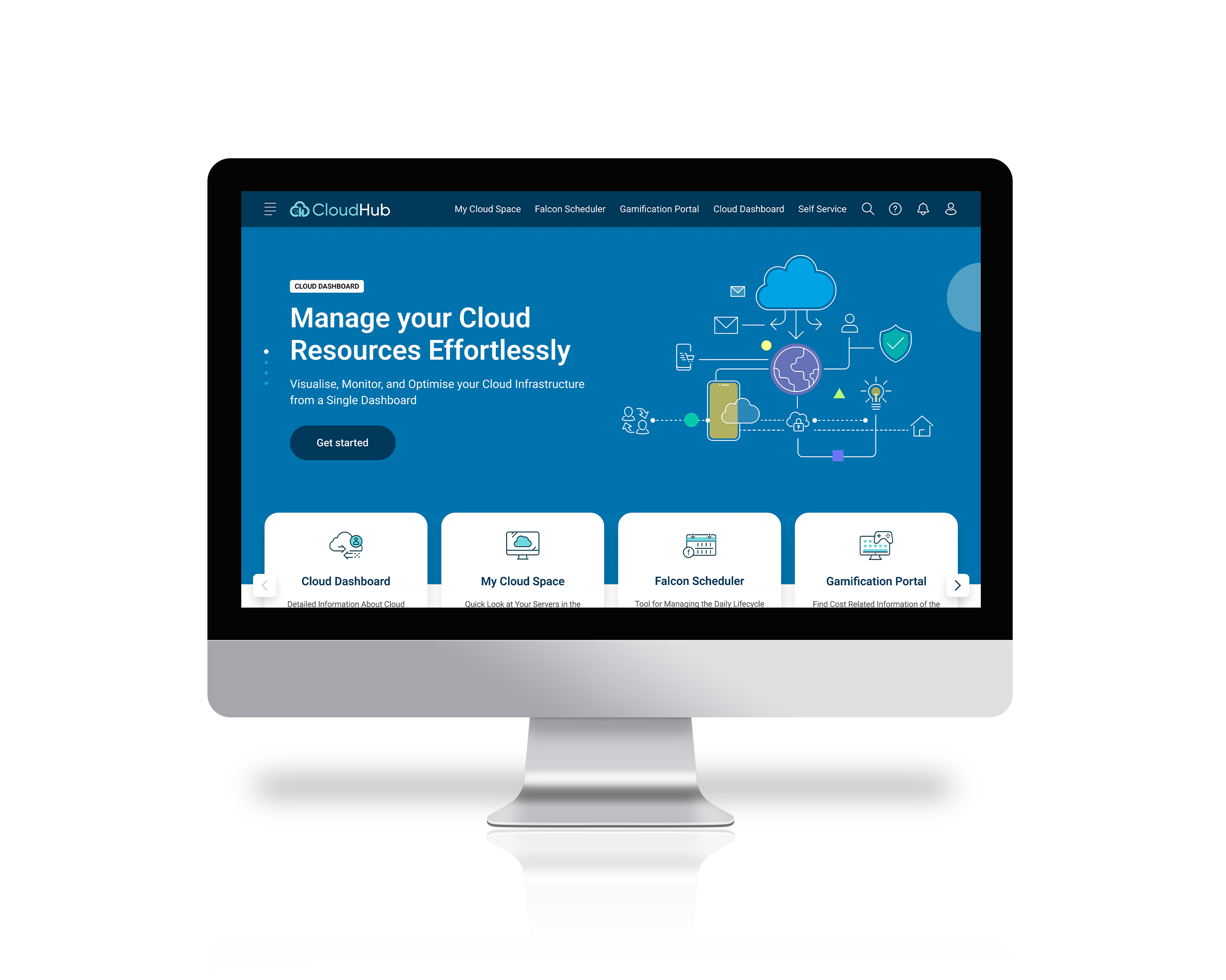
Originally documented as CloudHub. Presented here as Falcon Cloud, the name used in the portfolio design. UI images below are original design artifacts from the supplied Figma files and presentation. They retain the CloudHub product label; the case study is presented as Falcon Cloud.
THE PROBLEM
Built for internal familiarity.
External customers needed to find and use cloud capabilities without learning the team's internal structure.
THE APPROACH
Organize around intent.
Create, Control and Visibility provided a shared model for navigation, workflow clarity and visual consistency.
THE OUTCOME
A clearer product foundation.
The project reports faster task completion and provisioning. Measurement and attribution limits are detailed below.
01 / BUSINESS CONTEXT
A productization problem with operational consequences.
Why the redesign mattered
Harman's cloud-management portal supported internal infrastructure operations. The platform was developed internally at HARMAN and prepared for the sales team to take to market. An interface that depended on internal familiarity needed to become understandable to people who did not know the organization or its terminology.
The short-term brief in the Figma material was explicit: improve consistency, intuitiveness and visual clarity without changing the core functionality.
What was getting in the way
- Fragmented navigation made critical resources difficult to find.
- Provisioning and maintenance scheduling involved repetitive manual steps.
- Cost information was difficult to track and connect to operational decisions.
- Security and resource status lacked a coherent point of visibility.
How might we help an external cloud operator understand where to start, complete a task, and see its operational consequence without learning the tool's internal structure?
02 / OWNERSHIP & CONSTRAINTS
Make the design contribution explicit.
My design focus
Information architecture, workflow clarity, visual hierarchy, data presentation, interaction patterns and consistency across the experience.
Product boundary
The immediate redesign preserved existing capabilities. New cloud integrations, advanced access governance and predictive intelligence belonged to the broader product roadmap.
Decision principle
Use a clearer product model to reduce navigation and interpretation effort before adding more features or automation.
My role was Lead UI/UX Designer on the internally developed HARMAN platform. Sales commercialization was handled by the go-to-market team.
03 / RESEARCH & PROBLEM FRAMING
Understand the task before reorganizing the interface.
The project material combines stakeholder interviews, competitive analysis, personas, journey mapping, an empathy map and usability testing. These artifacts helped connect navigation problems to the work operators were trying to complete.
| Evidence | Design implication | Business relevance |
|---|---|---|
| Users struggled to locate resources across fragmented navigation. | Group capabilities by user intent and make the hierarchy predictable. | Reduce the learning burden for external customers. |
| 75% wanted more automation in the reported test material. | Reduce repetitive interactions and expose the next action clearly. | Help operators spend less time administering the tool. |
| 60% struggled with cost tracking in the reported test material. | Bring cost information closer to resource context and decision points. | Support better resource and spending decisions. |
| Complex cloud data was difficult to interpret. | Prioritize status, comparison and hierarchy over visual density. | Help teams identify what needs attention. |
The source does not give the exact denominator or question wording for the percentages. They are directional project findings, not population estimates.
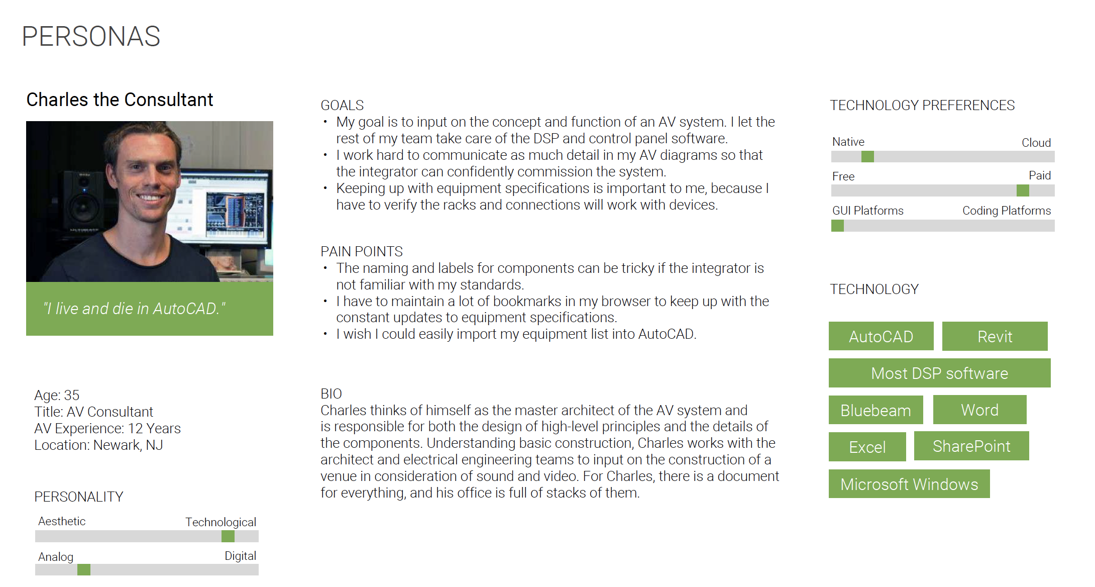
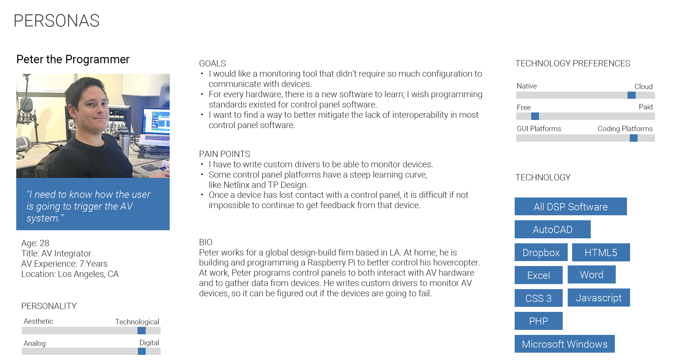
Cloud engineer
Needs to find resources, understand their state and move through provisioning without losing context.
IT administrator
Needs visibility into resource usage, cloud spending and operational risks to determine where intervention is required.
04 / STRATEGY & KEY DECISIONS
Replace a feature inventory with a usable mental model.
I organized the experience around Create, Control and Visibility, the three pillars in the Figma material. This provides a clearer route from intent to task, while retaining the cloud capabilities underneath.
Bring resources into use
Entry points for provisioning and self-service tasks.
Manage what is running
Resource management and operational scheduling.
Understand performance and cost
Dashboards, usage information and operational context.
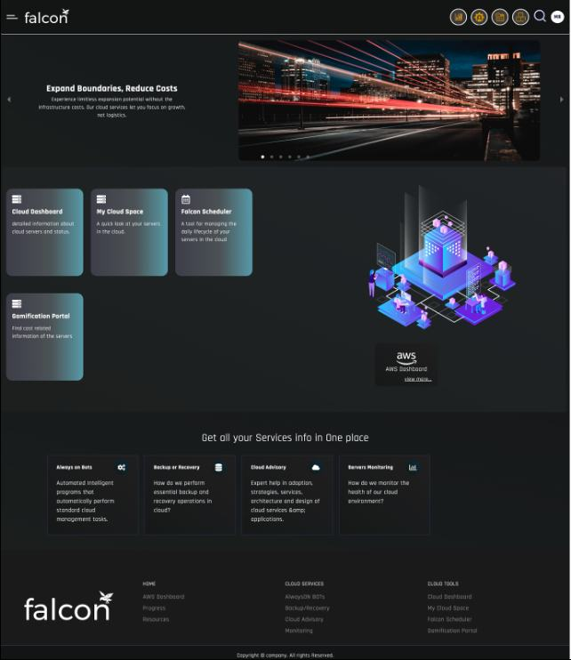
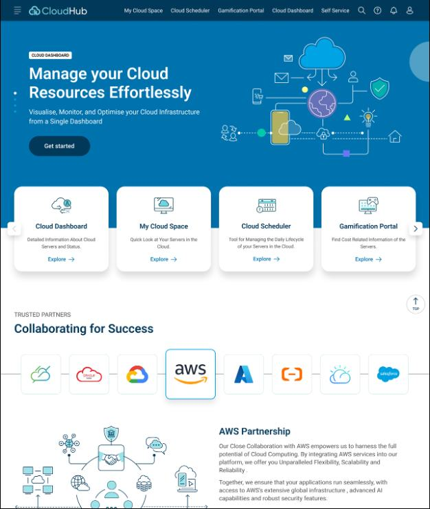
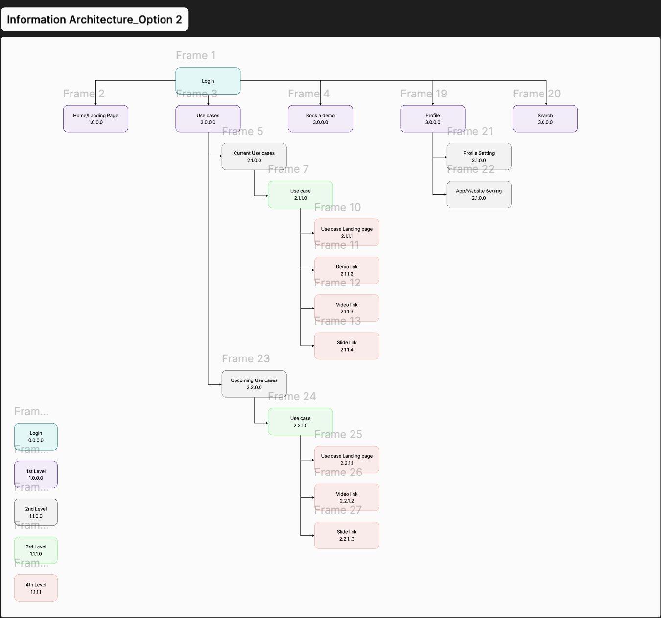
Organize by intent, not internal terminology.
Why: external customers should not need institutional knowledge to find a capability. The three-pillar structure connects the product's information architecture to recognizable tasks.
Tradeoff: a simpler hierarchy can hide specialist functions. Clear secondary navigation and contextual entry points preserve depth.
Make the overview a place to orient and act.
Why: resource usage, risks and cost information become more useful when users can identify a priority and continue into a relevant task.
Tradeoff: a unified dashboard can become overloaded. Hierarchy and priority states matter more than displaying every metric at once.
Reduce interaction overhead within the existing workflows.
Why: the brief required improvement without rebuilding core functionality. Clearer navigation, consistent controls and fewer unnecessary confirmations were practical ways to reduce friction.
Tradeoff: eliminating every confirmation would be inappropriate for consequential cloud actions. Friction should match the consequence of the operation.
Use consistency as a productization tool.
Why: a repeatable visual and interaction language helps new users transfer learning from one module to another.
Tradeoff: standard components must still accommodate the density and specificity of cloud operations.
05 / SYSTEMS & DELIVERY
A consistent experience across operational surfaces.
Documented design foundations
The design material establishes Roboto typography, a blue-led product palette and an icon library. The redesign applies a consistent visual language to navigation, dashboards and resource-management views.
The public portfolio uses my copper brand. The product design system and the portfolio brand serve different purposes.
Engineering considerations
The design needed to fit the existing capability model and available cloud data. Interface clarity does not, by itself, create new authorization rules, real-time telemetry or prediction services.
For further delivery, I would validate permission rules, data refresh behavior, asynchronous task states and error recovery with engineering rather than assume them from the visual design.
A shared information model and consistent interaction patterns give teams a basis for extending the product without making each module a separate learning problem.
DESIGN EVOLUTION
Make operational tasks easier to interpret.
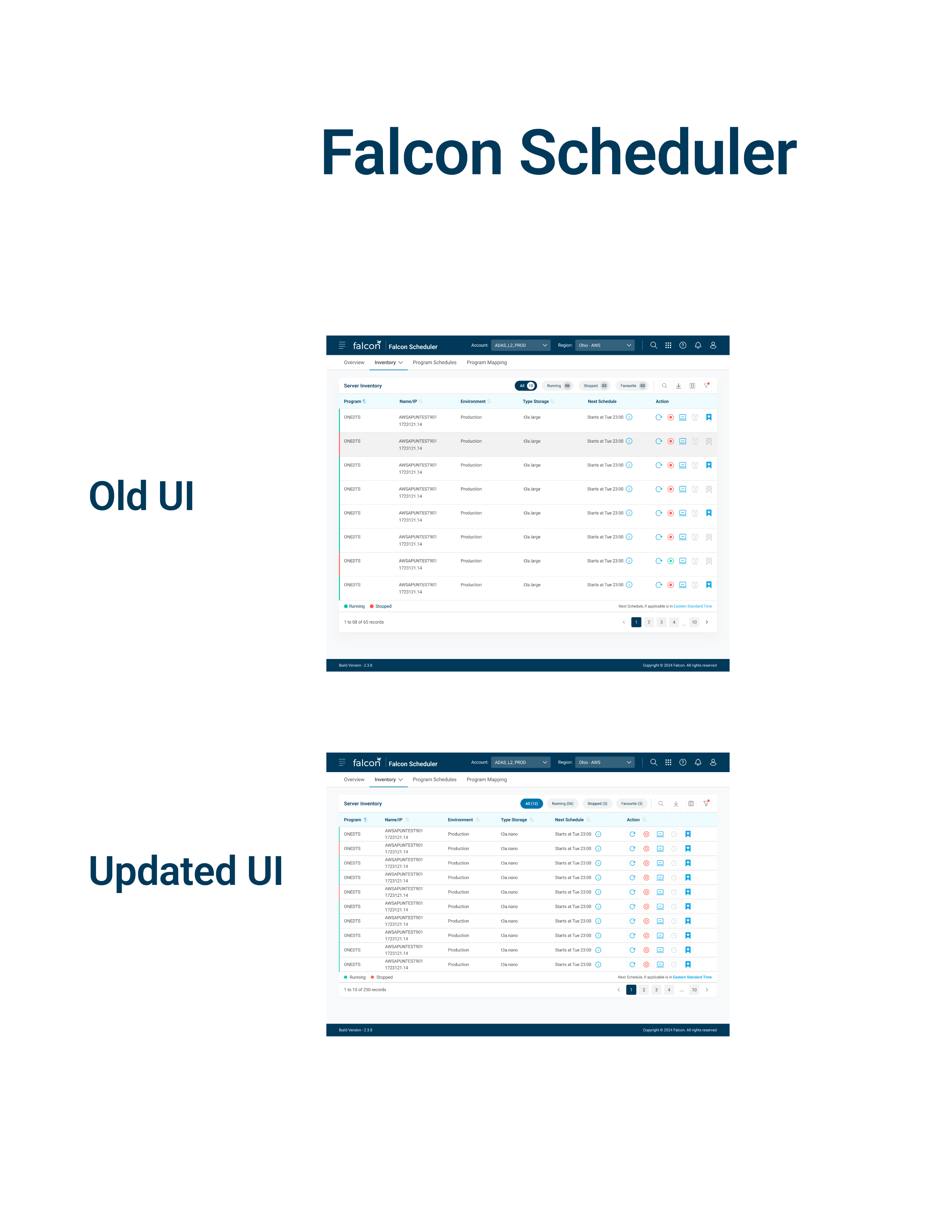
HIGH-FIDELITY OUTCOME
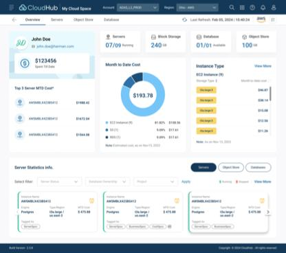
Resource context and cost visibility in one workspace.
My Cloud Space
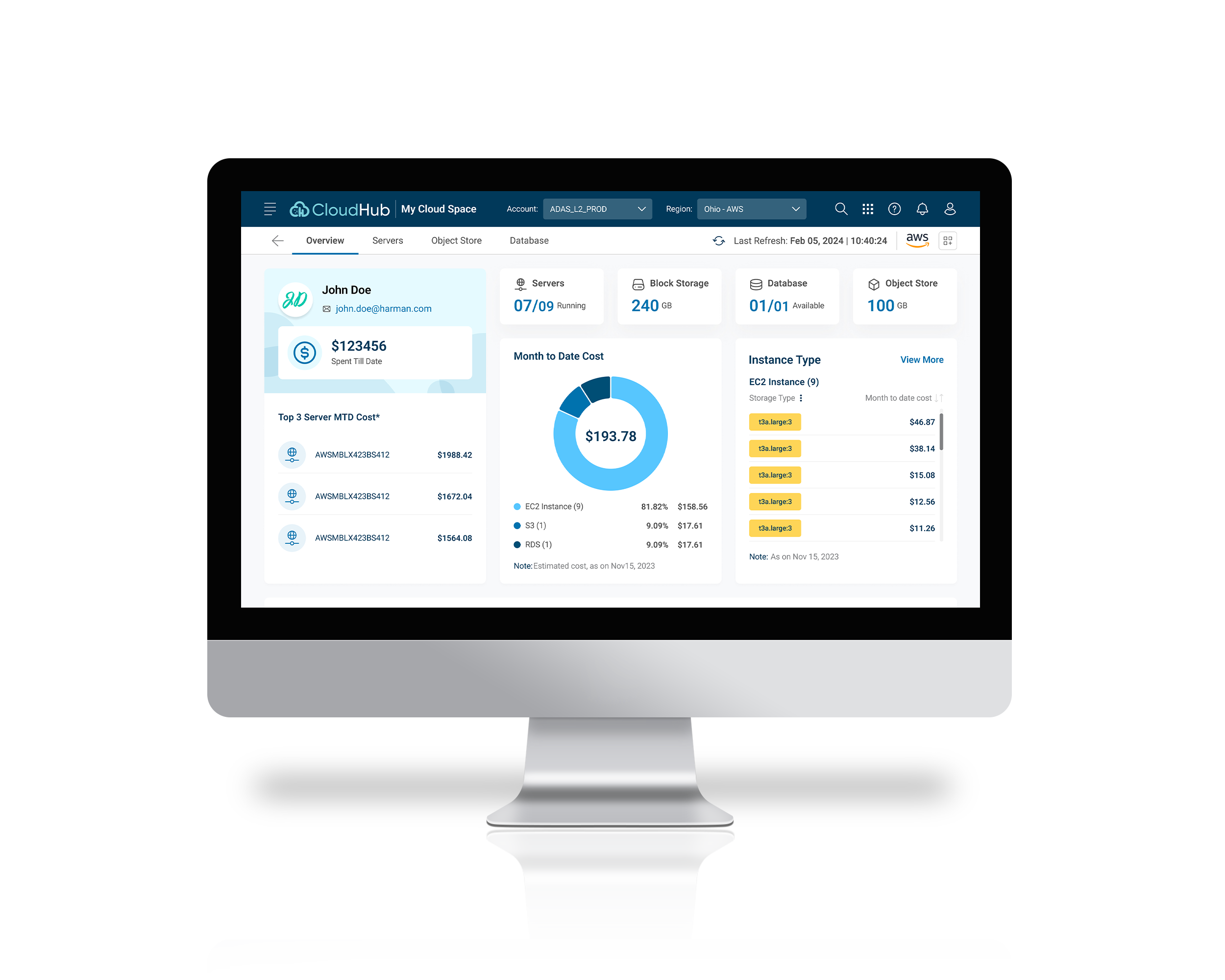
The final screen brings account context, resource counts, month-to-date spending and server statistics together. Summary cards orient the user before the more detailed inventory below.
Tabs distinguish servers, object storage and databases. Filters keep resource exploration close to the data, while consistent cards reduce the visual effort of comparing resources.
Original design artifact from the supplied project materials. Open any image for a closer view.
PRODUCT WALKTHROUGH
See the experience across product surfaces.
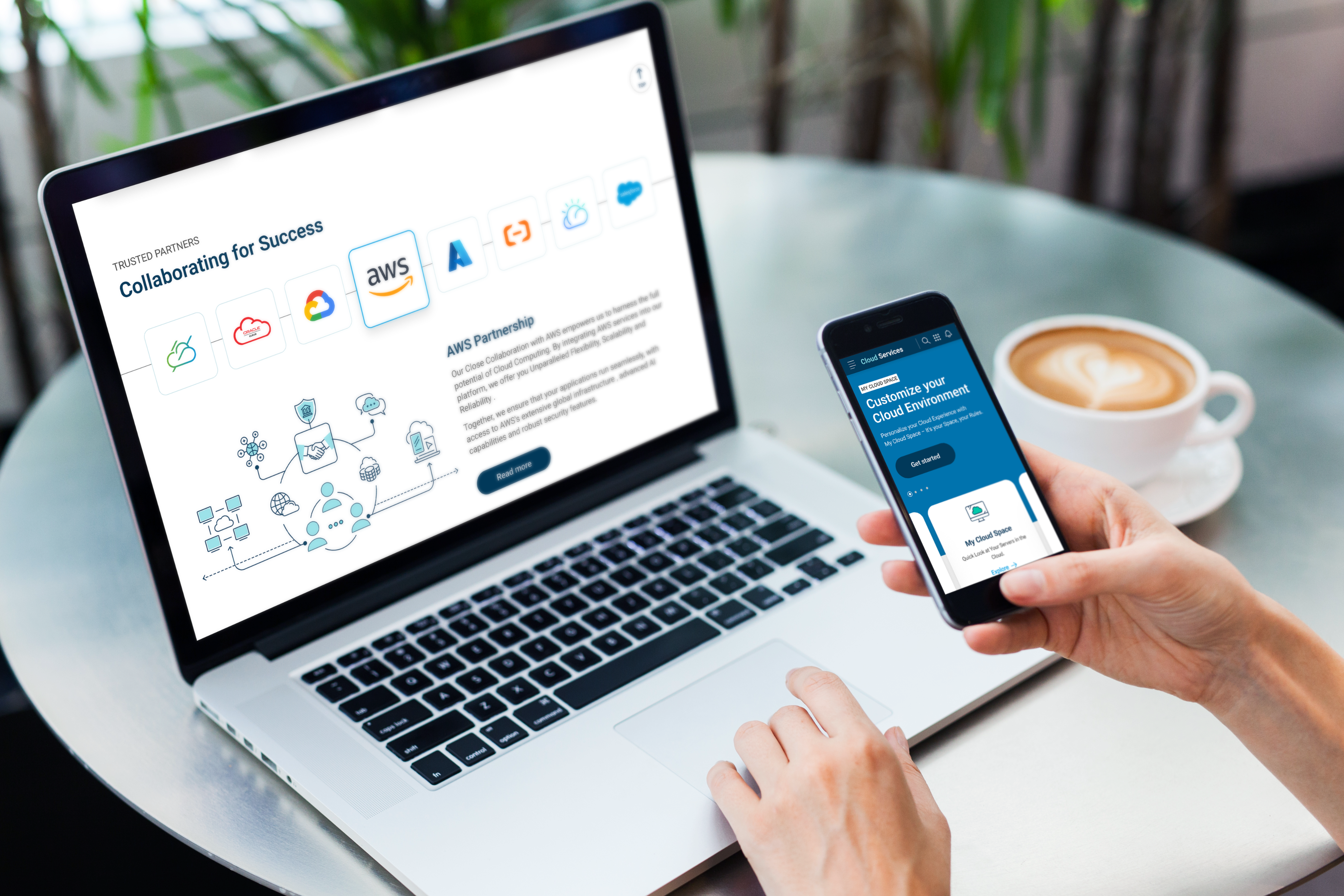
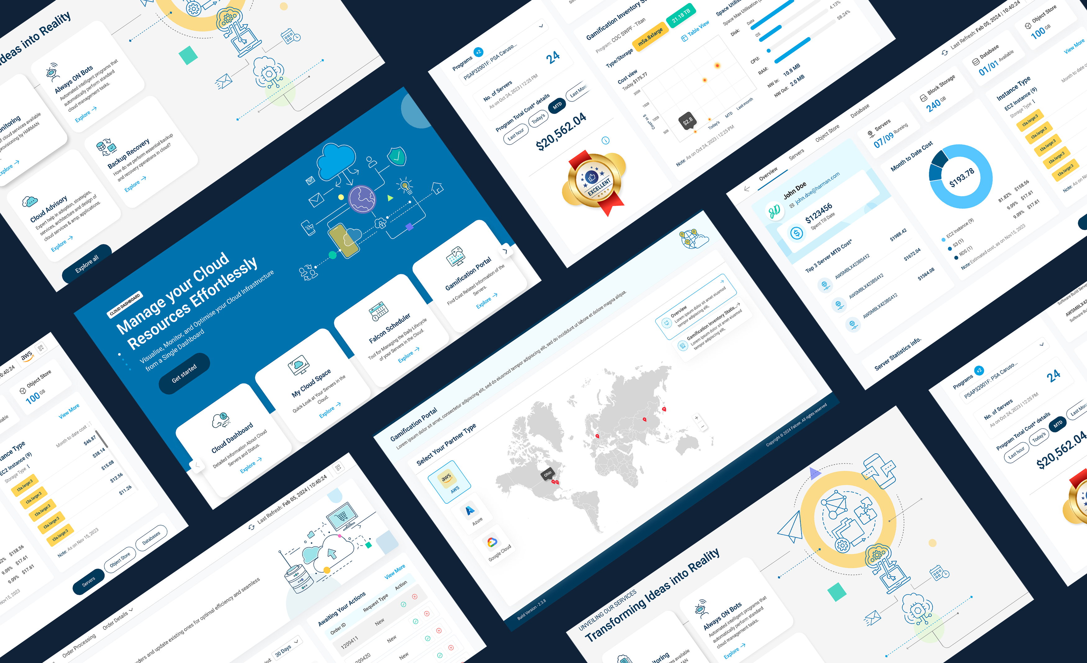
The original CloudHub presentation demonstrates the product proposition and interface across desktop and mobile.
Original product presentation / 1 minute 31 seconds. Click play to watch. Product imagery retains its original colors within the light portfolio theme.
06 / VALIDATION & ITERATION
Use feedback to change the design, not just confirm it.
The supplied material reports that 80% of users found the redesigned dashboard more intuitive. It also records three refinements: stronger hierarchy for alerts and priority items, removal of unnecessary confirmation steps, and recommendations personalized around usage history.
| Iteration | Reasoning | What to validate next |
|---|---|---|
| Elevate alerts and priority items. | Help operators identify important information before scanning secondary data. | Time to locate a priority issue and choose the relevant next action. |
| Remove unnecessary confirmations. | Reduce repeated interaction effort in routine tasks. | Completion time alongside errors and accidental actions. |
| Refine recommendations using usage context. | Make suggested actions more relevant to the operator's situation. | Recommendation usefulness, dismissal reasons and decision confidence. |
07 / OUTCOMES & EVIDENCE
Separate observed usability gains from business claims.
The usability results suggest that clearer structure and streamlined interaction improved the experience. The business material also reports reduced resource-management effort and improved cost efficiency.
The supplied deck does not include raw measurements, baseline task times, a control group, the cost-savings window or a method isolating design from product and engineering changes. These are reported project outcomes, not independently verified causal effects of my work. Customer adoption and market expansion are described qualitatively; no revenue, conversion or retention numbers are claimed.
Value demonstrated
A more coherent way to navigate existing cloud capabilities, stronger visual consistency, and a documented foundation for presenting the internal platform to external users.
Measurement I would establish next
First successful provisioning, core-task completion and error rate, repeated use of the three product areas, and realized savings from accepted recommendations. Segment by role and cloud environment to avoid misleading averages.
08 / PROPOSED AI & FINOPS EVOLUTION
Use AI to support a cloud decision before automating its execution.
Forward-looking proposal / not a claim of delivered LLM or agentic functionality.
The original roadmap includes broader cloud support, advanced cost prediction and stronger role-based access control. Today, I would build on that foundation with a constrained assistant for understanding costs and reviewing optimization opportunities.
Explain the cost change
Show the affected resources, ownership or tags, the comparison period and data freshness. Link an explanation to the underlying evidence.
Propose a bounded action
Present an optimization candidate with expected benefit, assumptions, affected workload and a way to reject or adjust it.
Keep execution governed
Require appropriate permission and review before a consequential change. Show progress, failure, recovery and an auditable action record.
Feasibility comes before the interface
This proposal depends on normalized billing data, reliable ownership metadata, enforced authorization and usable resource APIs. A conversational interface cannot compensate for missing or stale inputs.
Evaluate decision quality
Test evidence grounding, inappropriate recommendations, role-boundary violations and recovery from uncertain results. Measure realized value and unwanted changes, not just assistant engagement.
The proposal is informed by Microsoft's Human-AI Interaction guidance and the FinOps Framework. Neither framework is presented as a method used in the original project. HARMAN’s public CloudHub product page provides additional product context.
09 / REFLECTION
Productization starts with a mental model people can trust.
Falcon Cloud reinforced a central lesson in enterprise design: the product can have valuable capabilities and still be difficult to adopt. Clear structure, consistent interactions and a connection between data and action make those capabilities usable.
The next step is to carry the same discipline into intelligent experiences: define the decision, verify the inputs, make the recommendation understandable, and preserve control over consequential actions.
Back to selected workNext case study